Promoting your Haiku
Public Reading
Doing a reading in a cafe or conference is an excellent way to promote your work, whether you're published or not.
Enunciate. Have fun. Change tone. Surprise the listeners.

If you're published, make sure to read from the book so audience can see the cover.
After your reading, make sure to mention you have some promotional items so audience can leave with information on where to buy your book.
Freebie
When you're going to a haiku conference, consider bringing a freebie.
A freebie is a promotional item you give to attendees at a conference.
A freebie can take different forms: bookmarks, trifolds, postcards, 3D objects.

Tips
The best freebies are:
- Beautiful
- Well written
- Good promotional tool for the author
- Portable
1. Beautiful: does your freebie have a wow factor? A nice cover that will get people to pay attention? Is it printed on good quality paper? Color paper? Is the shape unusual?

Leaf-shaped haiku freebie by Deborah P Kolodji (HNA 2015)
2. Well written: Have you included your best haiku? Is the contents free of typos and grammar mistakes? Extra points if your contents fit the theme of the conference.
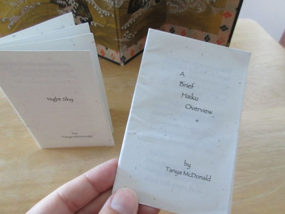
Booklets by Tanya McDonald
3. Good promotional tool for the author: have you included your name and contact information? The main goal of a freebie is promotion, so don’t forget these important details. A freebie is your business card.
4. Portable: is your freebie small enough to fit in a luggage? I really liked this took a haiku rock by Jeff Hoagland (HNA 2015), but it was too big to carry in my suitcase so I took a photo.

Haiku Rock by Jeff Hoagland (HNA 2015)
Do you know what freebie you’ll bring to your next conference?
Here are examples of the best promotional items for haiku poets.
Bookmarks
-
Bookmarks are a great promotional tool for writers and poets. To create a good bookmark for your next haiku conference, you’ll need: image, text, contact information (name, e-mail, website)
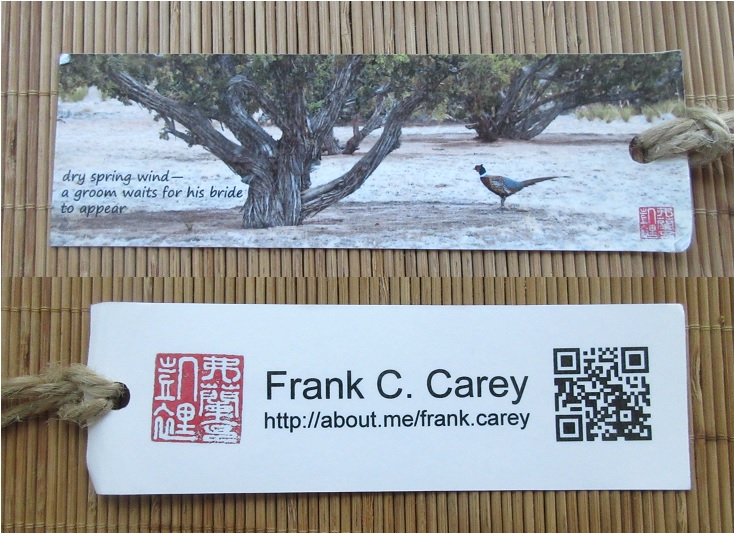
Bookmark by Frank Carey
This bookmark by Frank C Carey is one of my favorite freebies. On the front, there’s a photo with a haiku. At the back, there’s a red seal, a QR code, and Frank’s contact information. The design is clean and easy to read.
The bookmark is laminated. I like the addition of the twine: the color matches the photo. Not only is the bookmark beautiful, but it is also practical and durable. It’s been, and still is, my favorite bookmark to use. Every once in a while, I would see the address on the bookmark and visit Frank’s website, so I would say this bookmark was an effective promotional tool for its author.
(Unfortunately, Frank’s website is no longer active. He says he’s been out of the haiku game but continues to write science fiction. Considering I visited his website 3-4 times in 2 years, the bookmark did a good job in promoting him.)
Moon bookmark
I like this bookmark by Jennifer Sutherland. The design is beautiful. Unfortunutaley it doesn't have the author’s contact information (website, e-mail).

Moon bookmark, by Jennifer Sutherland (HNA 2015)
I like the simplicity of this laminated bookmark, but I don’t know the name of the author.

-
You can get creative with the photo and text alignment, like Margaret Beverland from New Zealand:

Bookmarks by Margaret Beverland
Why not use a different material, like a tag made of cloth?

Tag by Wanda Cook ; bookmark by an unknown author
You can also add more than one haiku, following this example by Claudia Coutu Radmore:

Bookmark by Clauda Coutu Radmore
Kala Ramesh created this beautiful bookmark with haiku, line drawing, and decorative twine.

Stanford Forrester used a printing press to create his bookmarks. This means he selected each font, placed them, and aligned them in a printing press, added the ink and printed the bookmarks one at a time.

Bookmark, by Stanford M Forrester
Tips for designing bookmarks:
- Make it beautiful so people will keep it.
- Add a twine so the bookmark won’t get lost in a book.
- Create them months in advance (it takes time to print them)
Trifolds
If you’re a Haiku Canada member you’re familiar with trifolds since there are usually one or two included with the Haiku Canada Review.
A few years back, Michael Dylan Welch started creating his own trifolds to share his haiku with attendees at conferences.
Today, trifolds are one of the most popular freebies at haiku conferences. They’re made of one sheet of paper printed double sided, and folded like a brochure.
Make sure it stands out. Design a good cover, chose a theme and use quality paper.
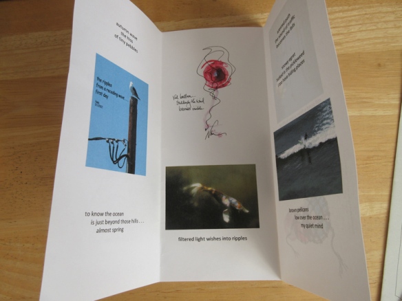
Letting Go: haiku & haiga (interior), by Naia
When designing a trifold, pay attention to the cover since it’s the first thing people will see. Make sure the cover has an attractive picture, a title, your name.

Letting Go: haiku & haiga (cover), by Naia
The back of the trifold usually holds bio-bibliographical and contact information.
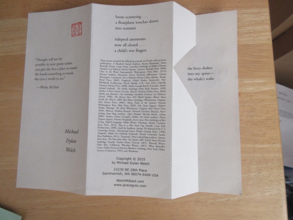
A Common Touch (back), by Michael Dylan Welch
You can create a trifold using the theme of the conference.

Autumn Haiku, by Barbara Hay ; Autumn Madness, by Beverly Acuff Momoi ( HNA 2015)
Since trifolds are one of the most popular format, you’ll have to make sure your trifold stands out. Here are some examples of creative trifolds.
Zigzag
Here’s a trifold (by Dianne Garcia) folded in a zigzag. It’s printed on one side only. What’s great about the zigzag fold is that the trifold can stand on a table.

Trifold, by Dianne Garcia
Four-folds
Randy Brooks created a narrow four-folds brochure for HNA 2015.

Haiku with legs (cover), by Randy Brooks (HNA 2015)

Haiku with legs (interior), by Randy Brooks (HNA 2015)
Cut-out
Michael Dylan Welch always have amazing trifolds that he gives away at each haiku conference. On his website Graceguts, you’ll find the files available to download for personal use.
I especially enjoy A Common Touch with its original cut-out triangle.

A Common Touch (cover), by Michael Dylan Welch

A Common Touch (interior), by Michael Dylan Welch
If you haven’t decided what to bring at the next haiku conference, trifolds are an excellent choice since they can be done quickly, and printed at home.
You’ll find brochures templates in most software like Word, InDesign. Insert your haiku, and voilà.
Postcards
Whether you’re a haiku poet, photographer or haiga artist, postcards are amazing promotional items to bring to a conference.
Format
The most common postcard sizes are:
- 4 x 6 inches
- 5.5 x 4.25 inches
- 8.5 x 5.5 inches
Templates
You’ll find templates in many software like Word, Publisher, InDesign. Many printers offer templates on their website.
Cost
Postcards can be expensive to print. However, the more you print, the less it costs per unit.
At my local print shop you can get 20 postcards for $15 or 100 postcards for $35. If you want something printed on the back, there’s an extra $10 fee. Shop around to find the best deals.
Make sure to order early as delivery can take some time.
Postcards
If you’re considering making postcards for your next conference, here are some examples to get you inspired.

Postcard by Frank Carey (HNA 2015)
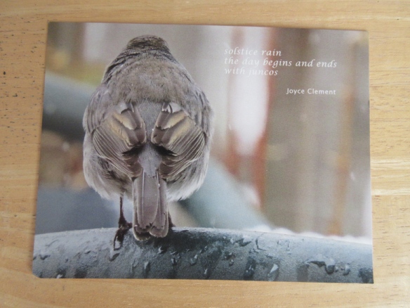
Postcard by Joyce Clement (HNA 2015)

Postcard by Bill Deegan (HNA 2015)

Postcard by Stevie Strang
Art postcards
This beautiful reversible postcard, handmade by Julie Bloss Kelsey, is one of my favorite freebies of all time.
It has everything I like: great haiku, nice paper, good handwriting, 3D objects. Well done!
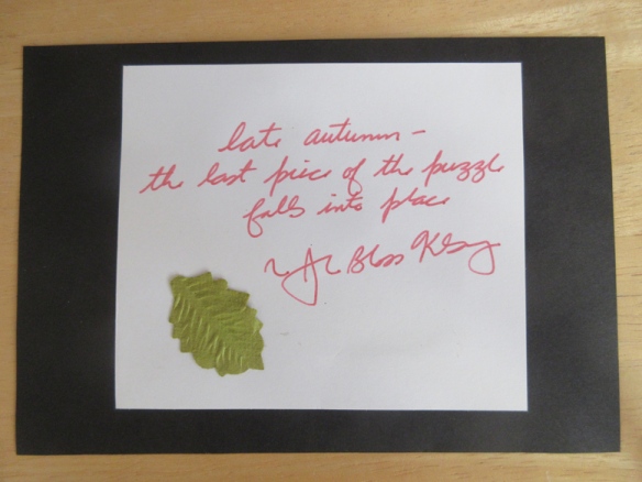
Reversible postcard (front) by Julie Bloss Kelsey (HNA 2015)
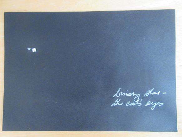
Reversible postcard (back) by Julie Bloss Kelsey (HNA 2015)
Book postcards
If you’ve published a book, a postcard is an excellent promotional tool. I like this simple postcard by Roberta Beary because it promotes her book The Unworn Necklace simply using a beautiful photo and haiku, instead of the usual book cover, making it a beautiful keepsake.

Postcard by Roberta Beary (HNA 2015)
Photo postcards
These two postcards are actually 4×6 photographs printed via Shutterfly. On the back, photographer David Giacalone printed his contact information.

Photo postcard by David Giacalone. (HNA 2015)
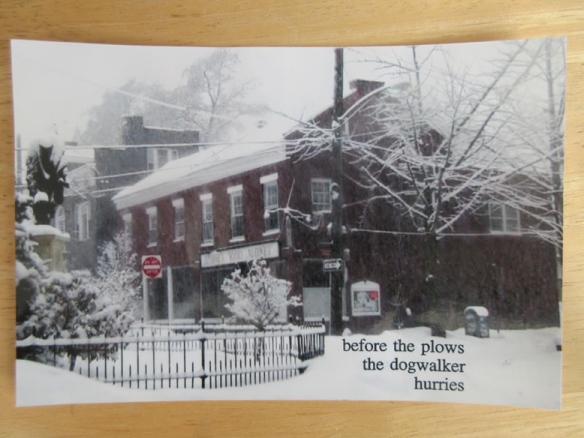
Photo postcard by David Giacalone. (HNA 2015)
Souvenir postcards
At HNA 2015, Terry Ann Carter performed her beautiful Chiyo-ni tribute and distributed these postcards to commemorate her unforgettable performance.

Do-it-yourself postcards
If you’re short on time, or are budget-conscious, you can also print postcards on cardstock at home. Just be prepared to spend lots of time cutting them. In this example, Claude Rodrigue also added a touch of color by hand.

Whatever style you chose, make sure to order your postcards early if you want to receive them before the conference.
Should you put a date on your freebie?
Some people like to indicate on their freebie, the name of the event it was created for (HNA 20XX or Seabeck 20XX) or the year it was created. The advantage is that it’s a good keepsake. People who find it later will know it was received at HNA 20XX. The downside is that if you have any leftovers at the end of the event, what will you do with them? If you distribute them at another event, or a year later, it will look outdated.
Should you reuse freebie?
Let’s say you have tons of leftovers from a previous conference.Should you give them at freebie at the another conference? Only if you’re sure most people at the second conference did not attend the first. Otherwise, I wouldn’t advise having the same freebie for two conferences.
I would say it's okay to reuse the freebie for two conferences held the same year, especially if the attenddes might be different.
How much time does it take to make a freebie?
You have to make a freebie for every attendee, so how much time it will take you depends of the size of the conference.
3D objects
Brochure, bookmarks and leaflet are fine, but everybody likes 3D object. Let’s look at some of the most original freebies I’ve gotten which were 3D object:
The Plastic Lizard
Most original : I remember someone at Seabeck who didn’t prepare any freebie, so they brought a handful of plastic lizard. Everybody went nuts for them. They were lovely and fun. However, promotional wise, there was no name attached, so it wasn’t very effective
Original: 4
Promo: 0
Transportable: 4
Heaviest freebie award
The Rock
At HNA 2015, there were stunning rock haiku on the table. A bit too heavy for me to carry home, though
Durabitliy: 5
transportabitlity: 0
Originality: 4
Little stone Buddha
Kris Kondo’s little stone Buddhas were cute, and instantly recognizable as Kris Kondos style.
Durability: 5
Transportability: 4 (so tiny you might lose it in your suitcase)
Originaitlity: 4

The little pouch made of kimono fabric.
Handmade with love.
A crochet frog bookmark
This little frog was given to each attendee of the French Haiku Festival in Quebec as part of their conference package. Lovely!
How to distribute freebie
Make enough for all attendees.
If you don’t have enough for everybody, consider giving them in person to people you meet. It’s a nice personal touch. Gary Gay was handing out pens with his haiku.
Conference-themed freebie
It's always a joy when a freebie is not only beautfil but also follow the theme of the conference.
These leaf haiku by Deborah Kolodji (HNA 2015). They are strickingly beautiful. Different autumn colour s and different shape. They were stunning on the table and you could not not see them. They fit the autumn theme of the conference.
How far in advance should you prepare your freebie?
The earlier you start the better. I'd say at least 2 months before the conference. Aim to have the freebie ready at least 1 month before the conference. Printing can take time.
Tidy up
Freebie table often get messy. Every once in a while, go back to tidy your freebies. A freebie is more attractive if it’s neatly piled. Consider having a container to hold your freebie to keep it together.
Tips for creating a freebie
A freebie takes time to create, and also cost money to print, so think about what you want to do and ask yourself if the final product will achieve your promotional goal.
- Ask yourself, what do I want to promote?
Find the best format for what you want to promote- If you are promoting a book, a postcard would be a good choice, or a bookmark.
- If you are promoting yourself as a haiku poet, bookmark, leaflet, postcard, 3D object are all good choice. For haiga poets: postcards
- Don’t wait till last minute.
Tips for designing good promotional bookmarks
- Use a professional printer
- Chose a good cardstock
- Use colour printing. Cost more, but worth it.
- Add a photo
- Add a haiku
- Add your information (name, e-mail or website)
- Make sure there is something at the top. That's the part that will stick out of the book. If you don't have a picture at the top, consider adding a tail, a piece of decorative thread. Otherwise, your bookmark might get lost in a book.
Next Chapter: Back to the pond »
